Imports
From liberator import charting
Histogram(**kwargs)
The Histogram function will generate a chart distribution/histogram chart that is branded with CloudQuant logo and colors.
returns
plotly.graph_objs._figure.Figure
Required Keyword Arguments:
- "df" = the pandas data frame with the data you want to graph
- "col" = (string) dataframe column name you wish to graph
Optional Keyword Arguments:
- "title" = (string) The title at the top of the chart. title can contain some html tags like:
-
<b></b><i></i> and <br>.
note: not all html tags are supported.
-
- "xlabel" = (string) the label for the x axis. xlabel can contain some html tags like:
-
<b></b><i></i> and <br>.
-
- "ylabel" = (string) the label for the y axis. ylabel can contain some html tags like:
-
<b></b><i></i> and <br>.
-
- "histnorm" = (string) One of 'percent', 'probability', 'density', or 'probability density'. If None, the output of histfunc is used as is. If 'probability', the output of histfunc for a given bin is divided by the sum of the output of histfunc for all bins. If 'percent', the output of histfunc for a given bin is divided by the sum of the output of histfunc for all bins and multiplied by 100. If 'density', the output of histfunc for a given bin is divided by the size of the bin. If 'probability density', the output of histfunc for a given bin is normalized such that it corresponds to the probability that a random event whose distribution is described by the output of histfunc will fall into that bin.
- "width" = Horizontal size (in px). Defaults to 800. Cannot be less than 400
- "height" = Vertical size (in px) . Defaults to 800. Cannot be less than 400
Charting overlays of another series - Optional
💡 note: it is a good idea to rename the overlay_col to a name that looks better visually
- "overlay_df" = the pandas data frame with the data you compare in the graph
- "overlay_col" = (string) dataframe column name you wish to compare in graph
Example Histogram
import liberator #CloudQuant Data Liberator
import pandas as pd #Pandas data frames
from liberator import charting #cloudquant charting
# query liberator to get the latest daily data for a list of stocks
res = liberator.query(name="daily_bars")
# convert the results to a dataframe
df_bars = liberator.get_dataframe(res)
# sort the market data by volume descending
df_bars = df_bars.sort_values(by = ['volume'], ascending=[False])
#calculate the change (close - open) for the market data in the data frame
change = df_bars.close - df_bars.open
df_bars["change"] = change
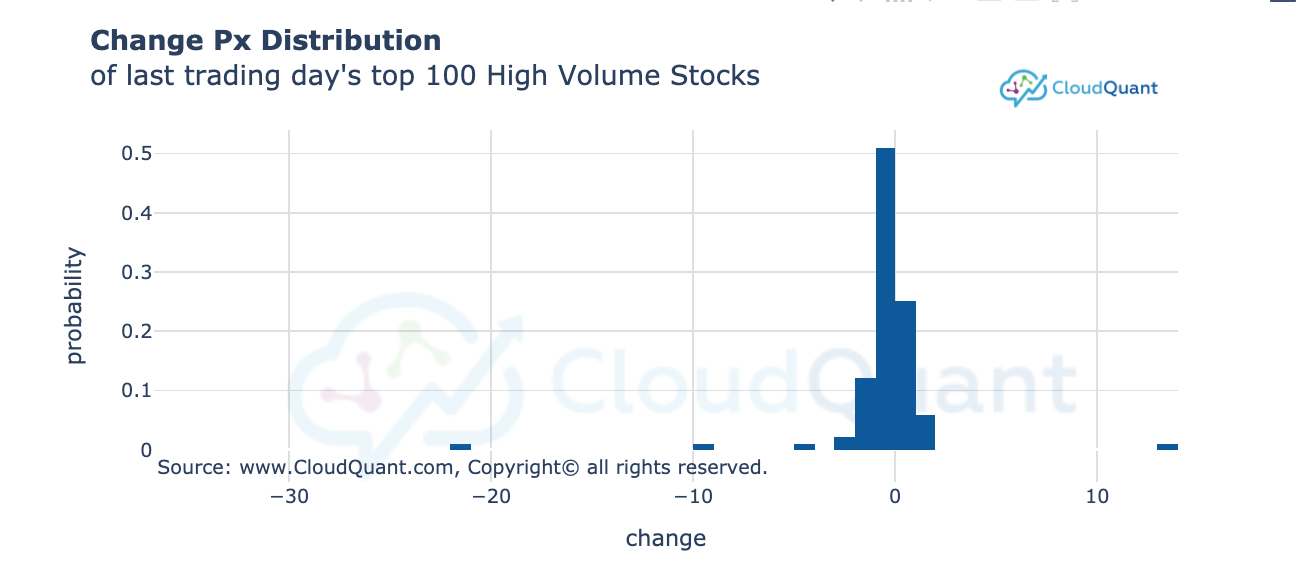
# create a histogram chart of the change price of the top 100 (by volume) stocks
change = df_bars.close - df_bars.open
fig = charting.Histogram(df = df_bars[0:100], col = "change",
title="<b>Change Px Distribution</b> <br>of last trading day's top 100 High Volume Stocks",
width = 800, height = 400, histnorm = "probability")
fig.show()
Candlestick(**kwargs)
The Candlestick function will generate a Candlestick chart that is branded with CloudQuant logo and colors.
returns either a single or an array of:
plotly.graph_objs._figure.Figure
Required Keyword Arguments:
- "df" = the pandas data frame with the OHLC data you want to graph This is typically a liberator query for "Daily Bars" or "Minute Bars"
- NOTE: the data frame must have at least 20 bars of data
💡 note: the data frame must have at least 20 bars of data
Optional Keyword Arguments:
- "title" = (string) The title at the top of the chart. title can contain some HTML tags like:
-
<b></b><i></i> and <br>.
-
- "xlabel" = (string) the label for the x axis. xlabel can contain some html tags like:
-
<b></b><i></i> and <br>.
- xlabel defaults to "Time (EST - New York)"
-
- "ylabel" = (string) the label for the y axis. ylabel can contain some HTML tags like:
-
<b></b><i></i> and <br>.
- defaults to "Price $ - US Dollars"
-
- "width" = Horizontal size (in px). Defaults to 800. Cannot be less than 700
- "height" = Vertical size (in px) . Defaults to 800. Cannot be less than 400
- "open" = the name of the open column. Defaults to "open"
- "high" = the name of the high column. Defaults to "high"
- "low" = the name of the low column. Defaults to "low"
- "close" = the name of the close column. Defaults to "close"
- "timestamp" = the name of the timestamp or date column. Defaults to "timestamp"
Showing a trade (must be round turn with both entry and exit values)
- "entry_px" = numeric entry price
- "entry_time" = timestamp of the entry trade
- "close_px" = numeric closing price
- "close_time" = timestsamp of the closing trade
- "entry_side" = The entry action "b" = buy or "s" = sell Entry side is used to compute the color for the shown trade.
Example Candlestick Chart
import liberator
import cloudquantcharting as charting
import pandas as pd
symbol = "XLE"
res = liberator.query(symbols = symbol, name="daily_bars", back_to = '5/1/2020')
df_bars = liberator.get_dataframe(res)

fig = charting.Candlestick(df=df_bars, overlay_df=gaspx,
                           width = 800, height= 600, xlabel = "Date")
fig.show()

Secondary Y Axis - To overlay a signal
-
"overlay_df" = the pandas data frame with the data you compare in the graph
-
"overlay_col" = (list) or (string) the list of column names or the single dataframe column name you wish to compare in graph. These will appear as thin solid lines on the graph.
note: line names will use the column names in the legend
note: all secondary axis values should be in the same numeric range otherwise the secondary axis will be useless.
-
"overlay_col2" = (list) or (string) the list of column names or the single dataframe column name you wish to compare in graph. These will appear as thin dashed lines on the graph.
note: line names will use the column names in the legend
note: all secondary axis values should be in the same numeric range otherwise the secondary axis will be useless.
Example Candlestick chart with a Data overlay
import liberator #CloudQuant Data Liberator
import pandas as pd #Pandas data frames
from liberator import charting #cloudquant charting
from datetime import datetime
from datetime import timedelta
back_to = (datetime.now() + timedelta(days=-360) ).strftime('%Y-%m-%d 23:59:59') #get the start date for N days ago
symbol = "SPY"
# query liberator to get the market data for our symbol for the last N days
res = liberator.query(name="daily_bars", symbols=symbol, back_to=back_to)
# convert the results to a dataframe
df_bars = liberator.get_dataframe(res)

# Read Retail gas prices
res = liberator.query( name="eia_gas_prices", back_to = back_to)
gaspx = liberator.get_dataframe(res)


# chart the market data showing a second Y-Axis
fig = charting.Candlestick(df=df_bars, overlay_df=gaspx,
                           overlay_col = "retail_gas_price",
                           height= 700, width=800,
                          xlabel = "Date",
                          title = "SPY vs Retail Gas Prices")
fig.show()

Studies for Candlestick Charts
💡 Important Note for Studies. If you request Studies you MAY receive more than one figure in your return set. Some studies return a second line chart. See the supported studies section below.
A good example of coding for variable types of output from this function is:
       res = Candlestick(df=df, study=MyStudy, study_columns=[ "high", "low", "close", "volume"])
       if isinstance(res, list):
           for f in res:
               f.show(renderer="png")
       else:
           res.show(renderer="png")
Supported Studies That return ONE FIGURE
    "BBANDS":"Bollinger Bands",  - Arguments = close
    "DEMA":"2x Exponential MA",  - Arguments = close
    "EMA":"Exponential MA",  - Arguments = close
    "HT_TRENDLINE":"Hilbert Transform",  - Arguments = close
    "KAMA":"Kaufman MA",  - Arguments = close
    "MA":"Moving average",  - Arguments = close
    "MAMA":"MESA Adaptive MA",  - Arguments = close
    "MIDPOINT":"MidPoint",  - Arguments = close
    "MIDPRICE":"Midpoint Price",   - Arguments = high, low
    "SAR":"Parabolic SAR",   - Arguments = high, low
    "SAREXT":"Parabolic SAR Ext",   - Arguments = high, low
    "SMA":"Simple MA",  - Arguments = close
    "T3":"T3 Moving Average",  - Arguments = close
    "TEMA":"T3 Exponential MA",  - Arguments = close
    "TRIMA":"Triangular MA",  - Arguments = close
    "WMA":"Weighted MA",  - Arguments = close
Supported Studies That return AN ARRAY of FIGURES
    "ADX":"Avg Dir Move Index",   - Arguments = high, low, close
    "ADXR":"AvgDir MoveIdx Rating",   - Arguments = high, low, close
    "APO":"ABS PX Oscillator",   - Arguments = close
    "AROON":"Aroon",   - Arguments = high, low
    "AROONOSC":"Aroon Oscillator",   - Arguments = high, low
    "BOP":"Balance Of Power",    - Arguments = open, high, low, close
    "CCI":"Cmdty Channel Idx",   - Arguments = high, low, close
    "CMO":"Chande Momentum Osc",   - Arguments = close
    "DX":"Directnl Move Idx",   - Arguments = high, low, close
    "MACD":"MA Convg/Diverg",   - Arguments = close
    "MACDEXT":"MACD EXT",  - Arguments = close
    "MFI":"Money Flow Index",    - Arguments = high, low, close, volume
    "MINUS_DI":"Minus DI",   - Arguments = high, low, close
    "MINUS_DM":"Minus DM",   - Arguments = high, low
    "MOM":"Momentum",  - Arguments = close
    "PLUS_DI":"Plus DI",   - Arguments = high, low, close
    "PLUS_DM":"Plus DM",   - Arguments = high, low
    "PPO":"%PX Oscillator",  - Arguments = close
    "ROC":"Rate of change",  - Arguments = close
    "ROCP":"Rate Δ %",  - Arguments = close
    "ROCR":"Rate Δ ratio",  - Arguments = close
    "ROCR100":"Rate Δ ratio 100",  - Arguments = close
    "RSI":"RSI",  - Arguments = close
    "STOCH":"Stochastic",   - Arguments = high, low, close
    "STOCHF":"Stochastic Fast",   - Arguments = high, low, close
    "STOCHRSI":"Stochastic RSI",  - Arguments = close
    "TRIX":"1-day ROC",  - Arguments = close
    "ULTOSC":"Ultimate Oscillator",   - Arguments = high, low, close
    "WILLR":"Williams %R",   - Arguments = high, low, close
    "ATR":"Avg True Range",   - Arguments = high, low, close
    "MACDFIX":"MA Convergence/Divergence ",   - Arguments = close
    "NATR":"Normalized Average True Range",   - Arguments = high, low, close
    "TRANGE": "True Range" ,   - Arguments = high, low, close
LineChart(**kwargs)
The LineChart function will generate a line chart that is branded with CloudQuant logo and colors.
returns
plotly.graph_objs._figure.Figure
Required Keyword Arguments:
- "df" = the pandas data frame with the data you want to graph
- "cols" = List containing (string) names of the dataframe column name you wish to graph as a line. If the cols is an empty list then it will chart any applicable overlays and studies.
- "x_column" = (string) the name of the dataframe column name you wish to use as the x axis. If not supplied then the x_column will default to the index of the dataframe.
Optional Keyword Arguments:
- "title" = (string) The title at the top of the chart. title can contain some html tags like
-
<b></b><i></i> and <br>.
note: not all html tags are supported.
-
- "xlabel" = (string) the label for the x axis. xlabel can contain some html tags like
-
<b></b><i></i> and <br>.
-
- "ylabel" = (string) the label for the y axis. ylabel can contain some html tags like
-
<b></b><i></i> and <br>.
-
- "width" = Horizontal size (in px). Defaults to 800. Cannot be less than 400
- "height" = Vertical size (in px) . Defaults to 800. Cannot be less than 300
Secondary Y Axis:
- "y2axis_name" = (string) the name of the secondary axis that will display on the right hand side of the chart. Adding this argument indicates that you want to add a second y axis. Without it no second axis will be created.
- overlay_df = the data frame that you want to plot. Important Note this dataframe must have a column with the same name and format as the X axis in your original dataframe (df)
- overlay_cols = [list of strings] this list of strings contains the names of the second Y axis data plots. example ["col1", "col2", "col3"]
Studies:
NOTE You must specify x_column to chart the studies, even if the x_column is timestamp
- "study" = Name of the study - See list of supported studies
- "study_columns" = column names list from the dataframe specified in "df" to perform the study upon in order. If you wish to show a study you must specify the study_column.
- "timeperiod" = the number of time periods in the study
-
Supported Studies
             "BBANDS": #Bollinger Bands (defaults to 5 time periods)
             "MAMA": #MESA Adaptive Moving Average  (defaults to 5 time periods)
             "DEMA": #Double Exponential Moving Average (defaults to 30 time periods)
             "EMA": #Exponential Moving Average (defaults to 30 time periods)
             "HT_TRENDLINE": #Hilbert Transform - Instantaneous Trendline (no time periods)
             "KAMA": #Kaufman Adaptive Moving Average (defaults to 30 time periods)
             "MA": #Moving average (defaults to 30 time periods)
             "MIDPOINT": #MidPoint over period (defaults to 14 time periods)
             "MIDPRICE": #Midpoint Price over period (defaults to 14 time periods)
             "SAR": #Parabolic SAR  (no time periods)
             "SAREXT": #Parabolic SAR - Extended  (no time periods)
             "SMA": #Simple Moving Average (defaults to 30 time periods)
             "T3": #Triple Exponential Moving Average (T3)  (no time periods)
             "TEMA": #Triple Exponential Moving Average (defaults to 30 time periods)
             "TRIMA": #Triangular Moving Average (defaults to 30 time periods)
             "WMA": #Weighted Moving Average (defaults to 30 time periods)
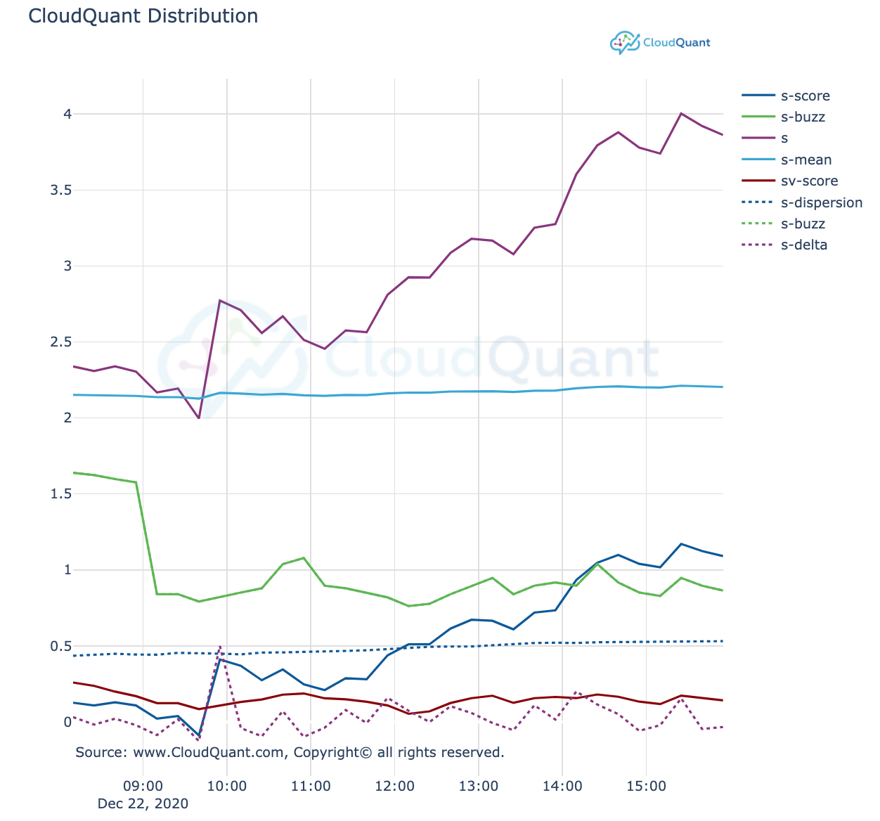
Line Chart Example
import cloudquantcharting
import liberator
from datetime import datetime as dt
res = liberator.query( symbols='AMZN', name='Twitter', back_to = '12/22/2020 08:00:00', as_of='12/22/2020 16:00:00')
twitter_df = liberator.get_dataframe(res)
fig = cloudquantcharting.LineChart(df=twitter_df, cols = ['s-score', 's-buzz', 's', 's-mean', 'sv-score','s-dispersion','s-buzz','s-delta'], x_column = "timestamp")
fig.show()
BarChart(**kwargs)
The BarChart function will generate a bar chart that is branded with CloudQuant logo and colors.
returns
plotly.graph_objs._figure.Figure
Required Keyword Arguments:
- "df" = the pandas data frame with the data you want to graph
- "xcol" = (string) dataframe column name you wish to graph as the X Axis
- note: of a value appears in the xcol more than once it will cause a stacked bar for that given value.
- "ycol" = (string) dataframe column name you wish to graph as the Y Axis. This should be a numeric column
Optional Keyword Arguments:
- "title" = (string) The title at the top of the chart. title can contain some html tags like
-
<b></b><i></i> and <br>.
-
- "xlabel" = (string) the label for the x axis. xlabel can contain some html tags like
-
<b></b><i></i>
-
- "ylabel" = (string) the label for the y axis. ylabel can contain some html tags like
-
<b></b> and <i></i>
-
- "width" = Horizontal size (in px). Defaults to 800. Cannot be less than 400
- "height" = Vertical size (in px) . Defaults to 400. Cannot be less than 300
- "singlecolor" = (bool) Should the bar chart be a single color (True or False). defaults to True.
- "orientation" = 'v' or 'h'. Defaults to v as vertical.
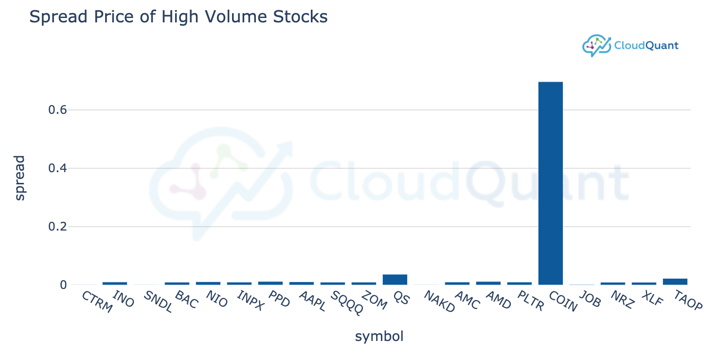
Barchart Example
import liberator #CloudQuant Data Liberator
import pandas as pd #Pandas data frames
from liberator import charting #cloudquant charting
res = liberator.query(name="daily_bars") # query liberator to get the latest daily data for a list of stocks
df_bars = liberator.get_dataframe(res) # convert the results to a dataframe
df_bars = df_bars.sort_values(by = ['volume'], ascending=[False]) # sort the market data by volume descending
fig = charting.BarChart(df = df_bars[0:20], xcol = "symbol", ycol="spread", title="Spread Price of High Volume Stocks", width = 800, height = 400)# create a bar chart of the spread price of the top 20 (by volume) stocks
fig.show()
PieChart(**kwargs)
The Pie function will generate a Pie chart that is branded with CloudQuant logo and colors.
returns
plotly.graph_objs._figure.Figure
Required Keyword Arguments:
- "df" = the pandas data frame with the data you want to graph
- "labelcol" = (string) dataframe column name you wish to graph
- "valuecol" = (string) dataframe numeric column use for the pie slice size
Optional Keyword Arguments:
-
"title" = (string) The title at the top of the chart. title can contain some html tags like
-
<b></b><i></i> and <br>. #note: not all html tags are supported.
-
-
"width" = Horizontal size (in px). Defaults to 800. Cannot be less than 400
-
"height" = Vertical size (in px) . Defaults to 400. Cannot be less than 300
-
"hole" = size of the donut hole (between 0 and 1). 0.0 equals no donut hole.
-
"colors" = Color sequence to use. Defaults to CQ Color palette. Optionally one of ['reds', 'greens', 'blues']
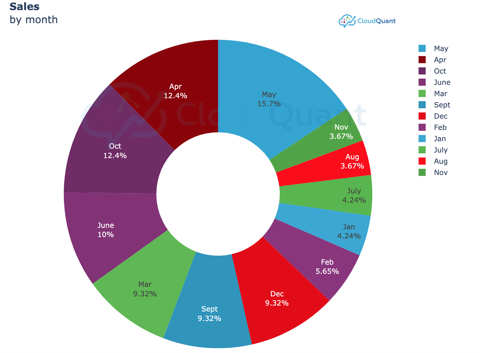
PieChart Example
import liberator #CloudQuant Data Liberator
import pandas as pd #Pandas data frames
from liberator import charting #cloudquant charting
#normally you would use liberator to query a data
values = [ ['Jan', '150000', 'USD'], ['Feb', '200000', 'USD'], ['Mar','330000', 'USD'], ['Apr', '440000', 'USD'],['May', '555000', 'USD'],['June', '355000', 'USD'],
['July', '150000', 'USD'], ['Aug', '130000', 'USD'], ['Sept','330000', 'USD'], ['Oct', '440000', 'USD'], ['Nov', '130000', 'USD'], ['Dec','330000', 'USD']]
df = pd.DataFrame(values, columns=["month", "sales", "currency"])
title = "<B>Sales</b><br>by month" #titles can use some html tags to make them look nicer
fig = charting.PieChart(df=df, labelcol='month', valuecol="sales",title = title, height = 700)
fig.show()
GroupedBarChart(**kwargs)
The GroupedBarChart function will generate a grouped bar chart that is branded with CloudQuant logo and colors.
returns
plotly.graph_objs._figure.Figure
Required Keyword Arguments:
- "df" = the pandas data frame with the data you want to graph
- "groups" = (string) dataframe column name you wish to graph as the group bar.
- "values" = (list) a list of dataframe column names you wish to graph as the values. This should be a numeric column
Optional Keyword Arguments:
- "title" = (string) The title at the top of the chart. title can contain some html tags like
<b></b><i></i> and <br> #Please note: not all html tags are supported.
- "group_label" = (string) the glabel for the x axis. The group_label can contain some html tags like
<b></b><i></i> and <br>.
- "value_label" = (string) the label for the y axis. The value_label can contain some html tags like
-
<b></b><i></i> and <br>.
-
- "width" = Horizontal size (in px). Defaults to 800. Cannot be less than 400
- "height" = Vertical size (in px) . Defaults to 400. Cannot be less than 300
- "colors" = A list of colors. Bars' color would iterate the list as a circle. Default set cq_colors list.
- "orientation" = 'v' or 'h'. Defaults to v as vertical.
Example GroupedBarChart
import liberator #CloudQuant Data Liberator
import pandas as pd #Pandas data frames
from liberator import charting #cloudquant charting
dataset_name = 'reddit_wallstreetbets_comments'
#get the last known values for WSB
df = liberator.get_dataframe(liberator.query(name = dataset_name))
df = df.loc[df['vader_body_sentiment_compound'] > 0]
# sort the dataframe
df = df.sort_values(by = ['vader_body_sentiment_compound'], ascending=[False])
#chart the top 5 sentiment scores
charting.GroupedBarChart(df=df[0:5], groups="symbol",
                         values = ["vader_body_sentiment_pos",    "vader_body_sentiment_compound", "textblob_body_sentiment_subjectivity"],
                        title="WS Bets Sentiment", group_label = "Symbol", value_label = "sentiment score")

ScatterPlot (**kwargs)
The ScatterPlot function will generate a scatter plot chart that is branded with CloudQuant logo and colors.
returns
plotly.graph_objs._figure.Figure
Required Keyword Arguments
- "df" = the pandas data frame with the data you want to graph
- "x_column" = (string) dataframe numeric column name you wish to graph on the horizontal axis
- "y_column" = (string) or (list) of strings with the name of the dataframe numeric column name you wish to graph on the vertical axis
Optional Keyword Arguments
- "title" = (string) The title at the top of the chart. title can contain some html tags like
-
<b></b><i></i> and <br> # Please note: not all html tags are supported.
-
- "width" = Horizontal size (in px). Defaults to 800. Cannot be less than 400
- "height" = Vertical size (in px) . Defaults to 400. Cannot be less than 300
- "xlabel" = the text to appear with the horizontal axis
- "ylabel" = the text to appear with the vertical axis
- "size_column" = the numerical column that will indicate the size of the scatter plot bubble. If the size_column contains negative values then the bubbles will color green and red for positive and negative.
- "size_multiplier" = numeric multiplier to change the size of the bubble.
- 💡 Important note, use the size_multiplier to set different sizes of the bubbles. Often the bubbles will be too small or fill the whole chart space. The size_multiplier can be used to correct this problem.
Example ScatterPlot
import liberator #CloudQuant Data Liberator
import pandas as pd #Pandas data frames
from liberator import charting #cloudquant charting
dataset_name = 'reddit_wallstreetbets_comments'
#get the last known values for WSB
df = liberator.get_dataframe(liberator.query(name = dataset_name))
df = df.loc[df['vader_body_sentiment_compound'] > 0]
# sort the dataframe
df = df.sort_values(by = ['vader_body_sentiment_compound'], ascending=[False])
#plot the scatter plot
fig = charting.ScatterPlot(df=df[0:200], x_column = "textblob_body_sentiment_subjectivity",  y_column = ['vader_body_sentiment_neu'],
                title="WS Bets Sentiment" ,size_multiplier = .15, width = 800, height = 800   )
fig.show()

addNotes(thefig, notes)
returns
plotly.graph_objs._figure.Figure
required arguments:
- thefig: a figure that has been returned by one of the CloudQuant Charting functions.
- notes: an list of dictionary items that contain the following:
        {'x':your_x_coordinate,

        'y':your_x_coordinate,

        'note':your_note_in_string_format,

        }
example addNotes
###############################################################################
# Import CloudQuant Data Liberator™ and query market data and then display the market data in a
# Candlestick chart using cloudquantcharting
#
import liberator #CloudQuant Data Liberator
import pandas as pd #Pandas data frames
from liberator import charting #cloudquant charting
from datetime import datetime
from datetime import timedelta
back_to = (datetime.now() + timedelta(days=-2) ).strftime('%Y-%m-%d 23:59:59') #get the start date for N days ago
symbol = "AAPL"
# query liberator to get the market data for our symbol for the last N days
res = liberator.query(name="minute_bars", symbols=symbol, back_to=back_to)
# convert the results to a dataframe
df_bars = liberator.get_dataframe(res)
# chart the market data
fig = charting.Candlestick(df=df_bars, title=symbol)


mydata = []
data = {'x':df_bars.timestamp[7],'y':df_bars.open[7], 'note':"T1"}
mydata.append(data)

data = {'x':df_bars.timestamp[155],'y':df_bars.open[155], 'note':"T2"}
mydata.append(data)

data = {'x':df_bars.timestamp[1000],'y':df_bars.open[1000], 'note':"T3"}
mydata.append(data)

fig = charting.addNotes(fig, mydata)
fig.show()
